Information and a Pop of Color
The UMW Text+Image block has a little bit of everything: room for an image, built in heading and paragraphs fields, and an optional call to action (CTA) button to keeps users exploring through your content. An important thing to note is that there is another block called “Media & Text” – this is not the same as the UMW Text+Image block and should not be used. Below is an example of the default text+image block.

UMW Text+Image Block Customization
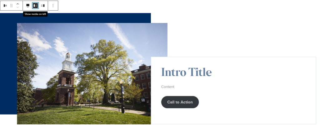
There are a few customization options for this block that can make each use of it feel unique, even if multiple are used on the same page. The background color can changed between four pre-approved brand colors, and image can be inserted on top of the colored background, and the text and image areas can be flipped. Below is an example of these options is use. The background color has been changed to a dark blue, there is an image, and the text and image areas are on opposite sides.
UMW Text+Image Block Menu
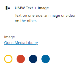
The block menu for the text+image block is where you can insert an image and change the background color.
To insert media, click “Open Media Library” and select the image you wish to use from the library of uploaded media. There will also be an option to upload media from this window.
The four colored circles indicate the available background colors you can use. The block will always default to the yellow, but you can easily change the background by clicking on any of the colored circles. The color will change in the editor view so you can see how it will look with the image you have chosen.

A unique function of this block is the ability to switch the positions of the text and image fields. To do this, click on the block to select it and look for the pop out menu to appear. The two options for how to orient the block are shown with two thin horizontal lines on one side and a tall rectangle on the other. The lines indicate where the text will be and the rectangle indicates where the image will be. In the example show here, the highlighted option indicates that the text will be on the left and the image will be on the right.
UMW Text+Image Text Fields
All text fields have placeholder text indicating what type of content is to be entered in each field.
- Intro Title: This is where you type your heading for the text+image block.
- Content: Enter any body text content in this field.
- Call to Action: This optional field can be filled in with text and linked to another URL. If the field is left empty, no button will appear in the published version of the block.