How to Make an Accordion
When referencing accordions on the website, you may hear them referred to simply as “accordions”, but you will find that there is no accordion block to insert on your page. Instead, there are two blocks that work together to make accordions possible: the UMW Accordion Container and UMW Collapsible Section. In order for an accordion to function properly, both blocks must be used correctly.
UMW Accordion Container
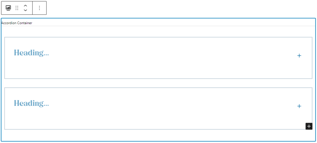
The UMW Accordion Container has no settings to change or customizable pieces to experiment with – the sole function of this block is to house the collapsible sections that make up our accordion. The example below shows what the accordion container looks like when first inserted into the editor.

Clicking the black button with the white plus sign will add a collapsible section to the accordion container.
UMW Collapsible Section
When you add a collapsible section to your accordion container, you will notice that it is always expanded. There will be a blue plus side on the right-hand side of the collapsible container – this symbol is not functional, it is simply there to indicate that you are working with a collapsible section. Collapsible sections also do not have any customization options. Below is an example of how the collapsible section by default when added to the accordion container.

Any number of collapsible sections can be added to the accordion by using the same black button with the white plus sign from before. To properly add additional sections, make sure you click inside of the accordion container and outside of the collapsible sections in that container. If done correctly, the button will appear in the bottom right corner as shown in the image below. These blocks can be tricky, so you may need to click in the accordion container an additional time before the button appears in the correct location When you hover over the button, it will say, “Add UMW Collapsible Section”. If the button says, “Add block” when you hover over it, you will need to click again in the accordion container block until the button appears in the correct location.

Editing the Collapsible Section
Click inside of the collapsible section start editing the content in this block. There is room for a heading at the top of the collapsible section with space below that for additional content. The additional content area can house paragraph text, headings, or some other blocks. Collapsible sections can be useful for organizing content, but avoid overfilling them with content as that defeats the purpose of this feature.
Below is an example of the collapsible section when it is selected to be edited.

UMW Collapsible Section Text Areas
The following text areas are available in collapsible sections.
- Heading: This serves as the heading for the content within the collapsible section. It is also the text that will appear when the published collapsible section is in the collapsed state.
- Additional content: This area can be filled with a variety of content – paragraph text, additional headings to organize content within the section, or some other blocks.
- Note: There is a known issue where turning text into a list inside of a collapsible section does not show bullet points in the editor view. Lists can still be used in collapsible sections as they will appear correctly when published, just be sure to preview your work frequently to check how the list is appearing.